Some time ago I happened to have been thinking of the photographs of, among others, Francesa Woodman. So I fired up my web browser to refresh my memory of her work. One of the pages I happened upon was at the British Tate museum and gallery website, as linked immediately below.
https://www.tate.org.uk/art/artworks/woodman-untitled-from-angel-series-rome-italy-ar00354
I noted that the Tate pages of artists’ individual pieces presented a “Summary” section which provided a literal description of the particular artwork as though one were describing what they were seeing to someone who was unable to see the piece. In this case, the Summary text on the Tate page was as follows:
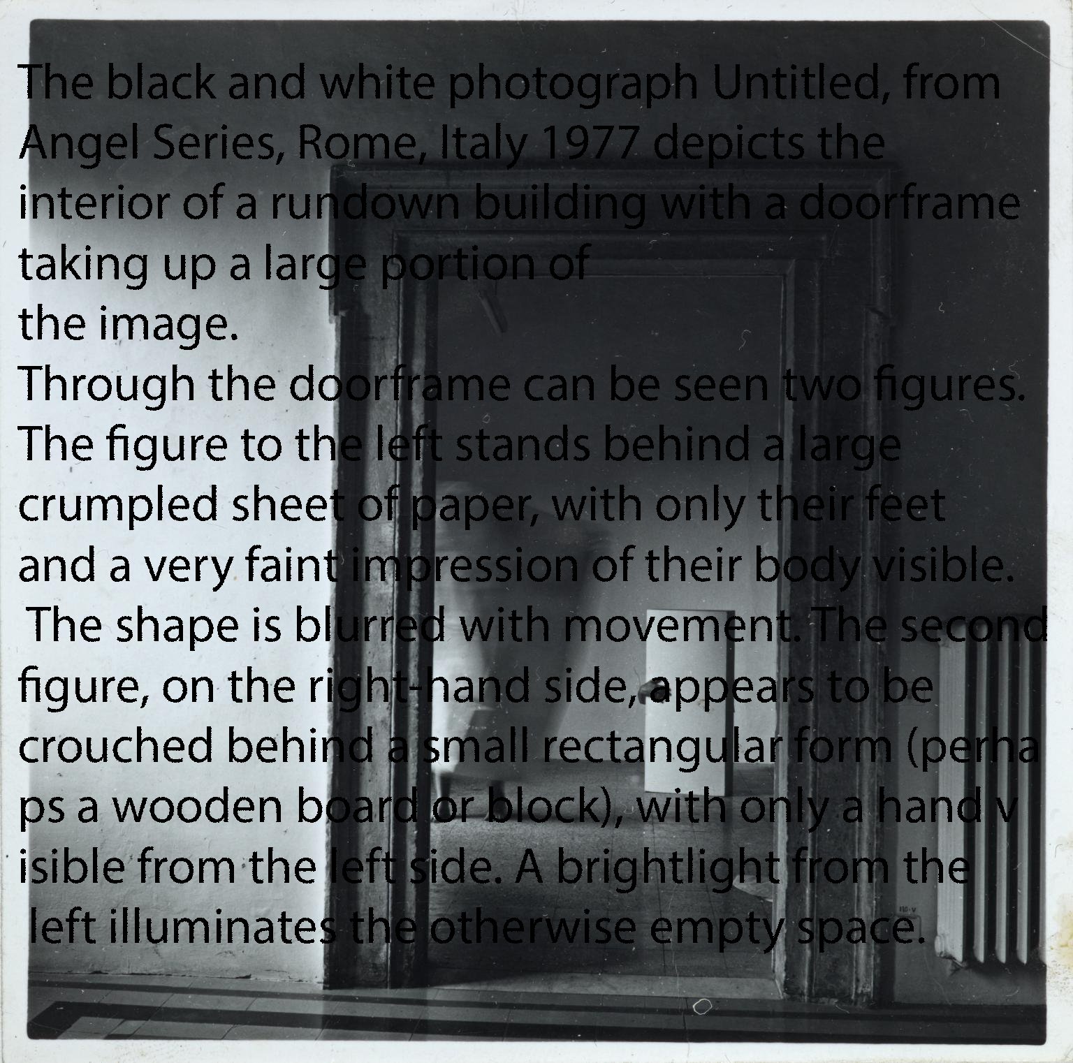
“The black and white photograph Untitled, from Angel Series, Rome, Italy 1977 depicts the interior of a rundown building, with a doorframe taking up a large portion of the image. Through the doorframe can be seen two figures. The figure to the left stands behind a large crumpled sheet of paper, with only their feet and a very faint impression of their body visible. The shape is blurred with movement. The second figure, on the right-hand side, appears to be crouched behind a small rectangular form (perhaps a wooden board or block), with only a hand visible from the left side. A bright light from the left illuminates the otherwise empty space.”
This, of course, reminded me of “Alt-Text”, a feature of website design and presentation that I had used since my days in the early 1990s of working with the HyperText Markup Language (HTML), as a facet of the computer programming I had been doing since the late 1970s. “Alt” in HTML is an attribute associated with an image to convey information about that image (and is invisible to usual web browsers). The Alt attribute was commonly used to trigger “screen reader” software used by blind or visually impaired Web users to translate Web pages into auditory and tactile cues, and would specifically provide such users with information about images that they would otherwise be unaware of.
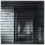
While the Tate website no longer uses Alt-Text strictly in this manner (modern programming technologies now provide many more versatile techniques), I wondered why the Tate chose to present its pieces in such a way. As I have been experimenting for a time with overlaying and imbedding text in some of my photographs, I tried to fuse the Woodman piece with the Tate textual description, with the following result (also seen at the top of this post):
I suppose that all this is by way of introduction to the “Experimental” section of this site where I am working through some new processes and approaches, one of which happens to entail overlaying, embedding or somehow infusing some of my photographs with textual material.


